Thursday, September 29, 2011

More Red Riding Hood

This was for my most recent Digital Painting assignment: LIGHTING. Obviously rough and needs a lot of work. Still, the atmosphere and mood is starting to come through. Any hints and tips on painting lips and mouths are greatly appreciated... I always save that part for last because, unlike the rest of it all, I REALLY don't "kinda" know the best way to go about it! That... and cropping. Grawr.

Anyways, enjoy, for now I must beat my brains against Maya while it beats me at life.

Created by the powers of Photoshop and Corel Sketchpad combined

Tuesday, September 13, 2011

Red Riding Hood Gone Digital

Woohoo! My first digital painting assignment is complete! There's still a lot of work I'd like to do on this, such as making the edges a bit sharper and adding in some more contrast, but overall, I'm quite happy with the way this turned out! Especially considering how long it's been since I've tackled a full on digital painting. Oh, and the assignment was to do a bust of the character. Hence why she only has a neck. I'll add the shoulders... someday. I also re-tweaked the design I initially had to Red Riding Hood. Honestly, the Tim Burton look was a happy accident... an accident of DESTINY.

Tools of the trade: Photoshop

Saturday, September 3, 2011

Red Riding Hood and Character Design Advice.

Just got through my first week of school! And I'm taking Digital Painting this semester! Right now, we're supposed to redesign a character from "Little Red Riding Hood," "Peter and the Wolf," or "Wizard of Oz." I settled on Red and came up with about a dozen different ideas and redesigns for her, but this was my favorite design-wise. I placed Red in a Victorian haunted mansion, where some of the haunts may not be as happy as the ones in Disney's Haunted Mansion... it was weird for me to even come up with this idea since ghost stories tend to freak me out (except the Haunted Mansion), but I liked the concept, and it's good to explore things that are different, but not squeamishly uncomfortable. This is my final design:

This Red was my first pass on the character, and I really liked her frazzled, haunted look. Rather like a Tim Burton style, which is also weird since I'm not really into his genre of movies. I appreciate them for their aesthetic qualities, but I tend to lean away from the creepy. But this pass on Red was really fun, so I decided to go with it.

A note on character design from my teacher regarding this pass and any kind of character design: You always want to add contrasting elements to your character and different layers of their personality. My first Red, for example, though interesting to look at, doesn't say too much about the character. She just looks a scared, and how do you root for someone who's always scared? Whereas in the second design, I changed her expression to be (hopefully) one that's not so scared, but maybe a bit curious and plucky. The final Red looks like she'd be more inclined to go around a creepy corner, though she's obviously still a little haunted-looking, but the first Red looks like she just might stay in her room, too afraid to venture into the unknown. Also, I tried to use contrasting curving and angled lines in the second design of Red to give her a disjointed look that matches her personality, but the first design has a lot of curves and looks a bit too safe for a haunted kind of story. I still want to mess with the design (dynamic pose plz), but I'm liking the way it's going!
This sketch just came to me one night.I've got an idea of what I think it is, and I'm sure you do, too ;) The biggest thing I wanted from the sketch was the feeling of reunion, and I hope I achieved it!

... gosh, I write a lot on here. Kudos to anyone who reads an entire post. At breakfast. With cereal and hot cocoa. Instead of the newspaper. I hope that what I have to say is informative and helpful!

Wednesday, August 24, 2011

More Summer Fun

I've been going a bit nuts with painting. It's too much fun for its own good. Micheal's is having an art supply sale (go there before the 27th if you need anything!), and I picked up some goaches since I've never tried them before and I thought I'd give it a go. Generally, goache is combined with acrylic and/or watercolor, so I experimented a bit and here's what I came up with:
I've also been using water soluble wax pastels, which are pretty much oil pastels, but act like watercolor pencils. You color in with the pastel, go over it with a wet paint brush, and ta-da! Instant painting! I think they blend a bit better than watercolor pencils, but they're better for coloring/painting in big areas, not so much detail.
I painted this with the water pastels and watercolor pencils. Roughly inspired by the art of fantastic fairy artist Brian Froud (you'll see his designs in "The Dark Crystal" and "Spiderwick.")

Friday, August 19, 2011

Summer Fun

Well... hi. That was an unexpected hiatus. But a necessary one. Being as it is summer, I decided to cut back on my computer time so I could complete my summer bucket list, which includes a lot of traveling! I also decided to do more than sketching and start playing with different mediums of art, and boy, it was fun! Some things just HAVE to be captured in color. So, enough rambling, here's some art from this summer:

I have a how-to-paint-with-acrylic book by Jerry Yarnell that I've been using. It breaks done dozens of paintings into step-by-step instructions, but I jazzed them up a bit to make them my own. And sorry for the lousy scan!


I went on a road trip to Utah with my mom and sister and we visited Arches and Canyonlands National Parks. It's absolutely breathtaking! Heck, we even went on a four-mile hike through Arches' Devil's Garden and saw about five different arches! We also got really interested in Southwestern art, which I've been trying to replicate on my won in pastel. It's a style that uses a lot of shapes and shadows... purple shadows. We also went to the Thanksgiving Point Gardens and I drew part of the Secret Garden area with Prisma color pencils.
I love National Parks.
My sister and I made a trip to the Monterey Bay Aquarium where we saw an albatross up close! Did you know that some albatrosses can have a wing span of 12 ft.? That they fly like hang gliders and hardly flap their wings? That they can fly for three days straight without eating and sleep while they fly? That they don't land, but crash-land? That if one lands on the prow of a ship, it's considered good luck (I guess it would be, if they always crash-land)? Needless to say, I was having more fun reading the information plaques and watching the sea life than anything else.
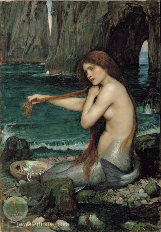
My mom recently gave me a J.W. Waterhouse book, so I've been trying to replicate his style, too. I noticed that Lord of the Rings artist, Alan Lee, takes after him a bit, too. So, I drew Rapunzel from Disney's "Tangled" in the Waterhouse style and used his piece "A Mermaid" as a reference.
And finally... Harry Potter. Oh, you better believe that I was one of those people who dressed up (I was an Auror and my sister was a Death Eater), went to the midnight premiere, brought TWO wands, my own Marauder's Map, glasses, a Gryffindor scarf, Quidditch goggles, a Harry Potter sketchbook, a brain chock full of anxiety to see the epic final chapter of the Harry Potter saga happen before my eyes, and bawled at the end (which was weird... I never cry during movies). And boy, I LOVE IT. That's the understatement of the century.

I LOVE IT.

I've been rereading the books this summer to relive this awesome story. As can only be expected from so much Harry Potter-ness, he and a bunch of the characters have made their way into my sketchbook. I've been playing around with different designs for Harry, some closer to Mary Grandpre's version, some more like Daniel Radcliffe look-alikes. I think this one's my favorite.


As for the end of Harry Potter? Psh. As if. Why do you think they're expanding the Wizarding World of Harry Potter and coming out with extended DVD versions? This is a story for the rest of time, guys. I seriously (or Sirius Lee) don't think there will ever be "another Harry Potter". Not too many books can stand the test of movie critics and make it all the way through the series, turn into theme parks, and spark more hype and debate and love over characters. Harry and co. are pretty special.

And all this isn't even scratching the tip of the iceberg of what's be going on this summer! :D And I hope you don't mind my rambling... Enjoy the art!

Harry Potter belongs to J.K. Rowling
Tangled belongs to Disney
Acrylic, Prisma, pastel, pencil

Monday, June 13, 2011

Post of Massiveness

First off, may I just channel some Mel Gibson and say...

FREEEEEEEDOOOOOOOOOOOOOOM!!!!!!!!!!!!!!!!!!!!!!!!!!!!!!!!!!!!!!!

In other words, I just finished my spring classes today! HUZZAH!!!!

And all this stuff on this post barely scratches the tip of the iceberg of work I had to do! HUZZAH!

... yeah. I'm happy to say I survived my first attempt at Maya. Maybe barely. But I survived! Our final project was to design a bug. Since I struggled with modeling, I decided to go simple and focus more on color, lighting, and composition. "Play to your strengths," as Mad-Eye Moody would say. As it turns out, my teacher really liked my bug! HUZZAH! (OK, last time, I promise)

In Ryan's gesture drawing class, we would have sketchbook days every week in which we had a theme and had to draw according to that theme with a combination of life and imagination. I loved it! Sure, some themes were difficult, but it made me stretch my imagination in ways I never thought I could. It's worth trying out something new; you never know what you can learn about yourself in the process! Some of my favorite themes were Chaos, Liquid, and aliens.


Our prompt for Aliens was to be like an explorer making a sketch-log of new plant and animal species. So, I kinda went a bit in the Spiderwick Chronicles direction. It may have also been because of the Scottish Festival at Thanksgiving Point this weekend. After spending a day around bagpipes, kilts, swords, caber-tossing, and Scottish accents, I started to think a bit about magical creatures and all, and went with that for my aliens. And "Cymru" is the Welsh word for Wales which, ironically, means "foreign."


And these are for fun... yes, I do art for fun, not just for school. Mt. Timpanogos is a great drawing reference, and the koi are from the Thanksgiving Point Gardens. Photography is quite awesome. I love being able to "stage" a scene and figure out how to make the most of the composition I have.


Pentel, Prisma, Staedtler, Photoshop, and Maya

Sunday, June 5, 2011

Some Sort of Art...


Just some class work for Gesture Drawing and Character Design. I must say, I'm REALLY liking ink and brush pen... Lots of fun design and emotional impact can be made with it.

Yes, it's "fake life"... I promise you, I HAVE been making failed drawings! And you should too!!!

Pentel, Prisma, and Staedtler