Friday, October 28, 2011

Sketches

Hey, I can still draw for fun! These are some James C. Christensen studies I did. I had a particularly fun time drawing the "Redhead." She has a really unique profile that was fun to capture. Titania's expression was also hard to catch and still make her look beautiful, but I think it turned out all right. Please check out more of his work! The guy is fantastic!


This was in response to Riku's new haircut in the new "Kingdom Hearts 3D" a.k.a. "Kingdom Hearts: Dream Drop Distance" trailer. I was wondering if he's suffering from "invisible hair" syndrome or something, considering how long it was in the second game. While my reaction was "D8," his is probably more like this:
Today, I got to go to Jake Parker's drawing and creativity workshop, and one of his ideas for getting over creative block and improving on drawing skills is to draw a hundred... something. Anything you want or anything you want to improve on. By drawing it a hundred different way, you encounter every creative problem and every creative solution. He also suggested to really make it a goal and to stick to it. So, here goes nothing... My goal is to draw a hundred different ways to fly at least once a week. I've had some ideas floating around in my head, so I figured that this would be a great way to start! So, here are the first two in my series of "Flyers." I'm excited to see where this goes :)
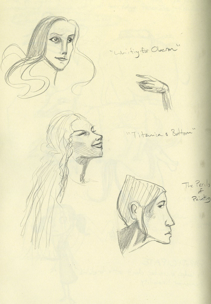
Everything done in pencil in my Piccadily sketchbook.

Tuesday, October 18, 2011

Digital Painting Midterm

After much blood, sweat, tears, sleep deprivation, starvation, dehydration, and anything ending -tion... I have completed my digital painting midterm! Little does Red know that, just around the corner, there will be a row of marble busts that will burst out into singing, "Grim grinning ghosts, come out to socialiiiiiiiiiiiiiiiiize!!!" Beware of ghosts, y'know, it being close to Halloween and all.

Photoshop, Corel Painter and Sketchpad
Wallpaper texture from here
"Grim Grinning Ghosts" by X Atencio

Friday, October 14, 2011

Halloween is coming...

... so I drew a witch. She mostly inspired by Elphaba a.k.a. the Wicked Witch of the West as seen in the musical "Wicked." I'm also part of the BYU Sketchbook Club now, and we do weekly drawing challenges, and this week's theme was "Witches!" Any excuse to draw something "Wicked"-esque is a good excuse. And sorry for the bad scan... this is what I get for buying a sketchbook bigger than my scanner.


The BYU Sketchbook Club also went on an excursion to the Hogle Zoo in Salt Lake City! That zoo has some of the best variety of animals I've ever seen! Plus, they were all extremely active that day, despite the rain, so we got to see the pumas and wolves playing (not together, though that would be interesting), plus some baby meerkats (WANT FOR THEY ARE CUTE), and some giraffes... way up close. As in five feet away. And they are cool. Copic markers, Prisma markers and pencils, ballpoint pen
Wicked isn't mine!

Sunday, October 2, 2011

I Draw for fun, too...


Yes... I draw for myself. I love markers, if that wasn't apparent. And watercolor pencils. And animals. And faces.

The Calvin and Hobbes tribute was for Storyboarding. The assignment was to draw a one-panel comic, so this is what I did! I had to clean up a bit of water damage... hope it doesn't kill the image :/ Bill Watterson is one of my favorite artists, pretty much because of "Calvin and Hobbes" and it's awesomeness. Would that there could be more comics like that... but that's what the books are for! Man, growing up, those books were read in bed, at dinner, for breakfast, on vacation... pages and covers have fallen off, but at least they're well-loved!

Go Air Jordan moms.

Prisma, Staedtler, and Copic Markers, and Prisma watercolor pencils.

Thursday, September 29, 2011

More Red Riding Hood

This was for my most recent Digital Painting assignment: LIGHTING. Obviously rough and needs a lot of work. Still, the atmosphere and mood is starting to come through. Any hints and tips on painting lips and mouths are greatly appreciated... I always save that part for last because, unlike the rest of it all, I REALLY don't "kinda" know the best way to go about it! That... and cropping. Grawr.

Anyways, enjoy, for now I must beat my brains against Maya while it beats me at life.

Created by the powers of Photoshop and Corel Sketchpad combined

Tuesday, September 13, 2011

Red Riding Hood Gone Digital

Woohoo! My first digital painting assignment is complete! There's still a lot of work I'd like to do on this, such as making the edges a bit sharper and adding in some more contrast, but overall, I'm quite happy with the way this turned out! Especially considering how long it's been since I've tackled a full on digital painting. Oh, and the assignment was to do a bust of the character. Hence why she only has a neck. I'll add the shoulders... someday. I also re-tweaked the design I initially had to Red Riding Hood. Honestly, the Tim Burton look was a happy accident... an accident of DESTINY.

Tools of the trade: Photoshop

Saturday, September 3, 2011

Red Riding Hood and Character Design Advice.

Just got through my first week of school! And I'm taking Digital Painting this semester! Right now, we're supposed to redesign a character from "Little Red Riding Hood," "Peter and the Wolf," or "Wizard of Oz." I settled on Red and came up with about a dozen different ideas and redesigns for her, but this was my favorite design-wise. I placed Red in a Victorian haunted mansion, where some of the haunts may not be as happy as the ones in Disney's Haunted Mansion... it was weird for me to even come up with this idea since ghost stories tend to freak me out (except the Haunted Mansion), but I liked the concept, and it's good to explore things that are different, but not squeamishly uncomfortable. This is my final design:

This Red was my first pass on the character, and I really liked her frazzled, haunted look. Rather like a Tim Burton style, which is also weird since I'm not really into his genre of movies. I appreciate them for their aesthetic qualities, but I tend to lean away from the creepy. But this pass on Red was really fun, so I decided to go with it.

A note on character design from my teacher regarding this pass and any kind of character design: You always want to add contrasting elements to your character and different layers of their personality. My first Red, for example, though interesting to look at, doesn't say too much about the character. She just looks a scared, and how do you root for someone who's always scared? Whereas in the second design, I changed her expression to be (hopefully) one that's not so scared, but maybe a bit curious and plucky. The final Red looks like she'd be more inclined to go around a creepy corner, though she's obviously still a little haunted-looking, but the first Red looks like she just might stay in her room, too afraid to venture into the unknown. Also, I tried to use contrasting curving and angled lines in the second design of Red to give her a disjointed look that matches her personality, but the first design has a lot of curves and looks a bit too safe for a haunted kind of story. I still want to mess with the design (dynamic pose plz), but I'm liking the way it's going!
This sketch just came to me one night.I've got an idea of what I think it is, and I'm sure you do, too ;) The biggest thing I wanted from the sketch was the feeling of reunion, and I hope I achieved it!

... gosh, I write a lot on here. Kudos to anyone who reads an entire post. At breakfast. With cereal and hot cocoa. Instead of the newspaper. I hope that what I have to say is informative and helpful!